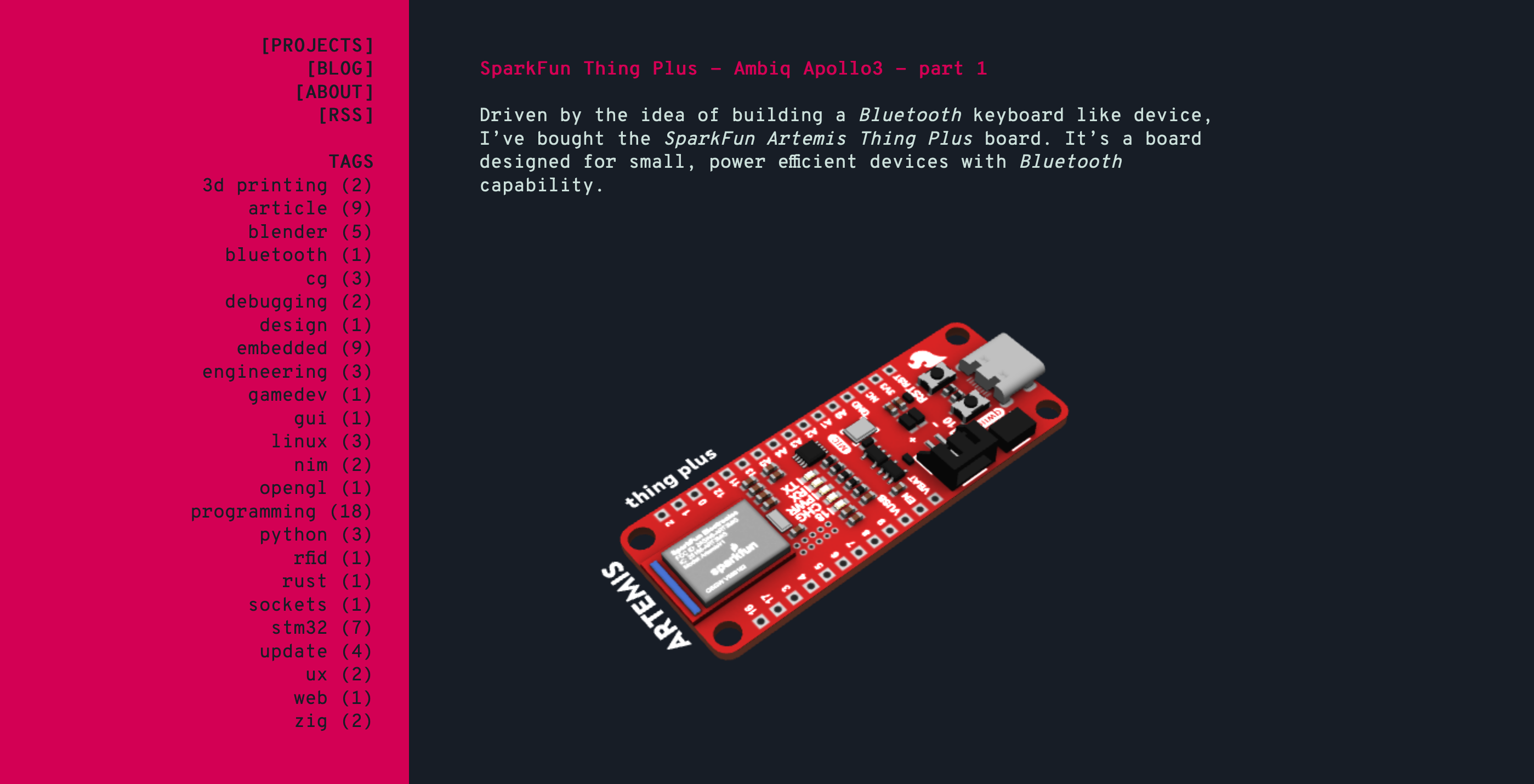
Website... this website
You should start a website. It’s quite fun!

Sometimes I get to improve this website by accident. I stumble on an interesting project, that fits well with what I still haven’t addressed. This time it’s superhtml. It checks HTML files for syntax errors and reformats them. It can be used as a cli application or as a LSP server.
After Hugo builds this website, the HTML isn’t that well formatted. It’s an eye sore that doesn’t have many functional consequences. It could be “solved” by minifying the HTML. However, I’m not really interested in minifying my HTML, for reasons that feel logical but I don’t have evidence to back them up.
The error checking that superhtml provides is more interesting to me. I have caught an embarrassing amount of issues, after adding this step to my CI:
superhtml fmt public/More importantly, since it’s part of my CI, I’ll notice any future mistakes I might introduce in my HTML.
It’s also great to see that superhtml was written in Zig, considering I support Zig financially. It also means that I don’t have to touch npm or any other cancerous environment. It’s a single binary that you pull, unpack and run. What’s more is that it has no dynamic dependencies.
mc@computer:~/Downloads/x86_64-linux-musl$ ldd superhtml
	not a dynamic executable
Very zen.
This article, titled “CSS is fun again”, put the OKLCH color space on my radar. It’s a color space, created in 2020, which covers capabilities of the most common, sRGB screens, but also the newer ones, like those using P3 or Rec. 2020 color spaces.
Oklab and OKLCH were created by Björn Ottosson, to fix issue in the CIE LAB and LCH color spaces. That matters if you’re curious why there’s so many abbreviations: CIE LAB (or Lab), Oklab, OKLCH. Let’s not even touch the topic of varying capitalization…
Oklab uses Cartesian coordinates to encode a point in its color space. OKLCH uses polar
coordinates. That’s why an OKLCH encoded color, in CSS syntax, looks like so
oklch(65.39% 0.3 10.2) - the first value being lightness (it’s polar coordinates, so imagine
it’s moving on its vertical axis, often label Z), the second chroma (a bit of an arbitrary
value that, for sRGB and P3, stays below 0.37 - that’s the radius from the cylinder’s center),
the third hue (this maps to the angle, often labeled as the theta angle - this one can be between
0 and 360, which covers the entire cylinder).
If you’d like to know more about the math and history then you should check this article, by Evil Martians.
Let’s go back to the practical side of things. I’m using SASS for this website (well it’s SCSS to be more precise - there are two different syntaxes one can use). SASS extends CSS, through new functionality but it also adds a build step, where it translates it’s own syntax into the currently, widely supported CSS. It’s an additional dependency that, while useful, adds complexity. I’d like to drop SASS completely.
One of the features that SASS brought were variables. Those can be used like so:
$deep-red: #d30054;

.content {
  background: $deep-red;
}
CSS managed to catch up and nowadays it supports variables, albeit using a different syntax:
:root {
  --deep-red: #d30054;
}

.content {
  background: var(--deep-red);
}
Variables are just one feature. Another one was CSS selectors nesting. By now it’s also supported in the vanilla CSS. There’s way more to SASS, but I’m not the person to explain those features and their benefits - I just don’t use them.
I use a few color modification functions, like desature, darken, etc., that are still missing
in plain CSS. SASS team can move quicker than W3C, the developer of the CSS technical
specification, and the browsers’ teams. As soon as the
CSS Color Module Level 5
gets finalized and gets implemented, in all major browsers, I will be able to fully drop SASS.
Here is an example of something you can do in SASS, right now:
$deep-red: oklch(55.39% 0.221 10.2)

$bright-red: scale-color($deep-red, $lightness: 20%);
Here is plain CSS, that does the same, which isn’t yet supported by Firefox:
:root {
  --deep-red: oklch(55.39% 0.221 10.2);
  --light-red: oklch(from var(--deep-red), calc(l + 20%) c h);
}
Here’s the link to check which browsers support the Relative Oklch colors.
I have moved my CSS file closer to plain CSS. One things that’s worth mentioning is that I might be excluding users with older versions of browsers installed. In order to address that I’d like to explore Lightning CSS. That might become my new dependency, but one that solves and issue I have ignored for quite a while now.
It’s been quite rewarding to improve this website here and there. My new, HTMX based comment system isn’t fully ready. The functionality is there but it’s lacking a good CSS. You might notice that the comments are visually very… basic.
Working on my comments system required some NGINX work. I had to prepare a config file which
correctly redirects the traffic to my comments server. I have found bug in my configuration
file for this website, which made www.ciesie.com not redirect to the http://ciesie.com.
That’s fixed now.
I have also experimented with HTML’s <picture> element. It allows you to implement a responsive
images system - the browser chooses an appropriate image, from a provided list. The basic setup
looks like this:
<picture>
  <img src="small_img.webp"
       height="420"
       srcset="small_img.webp 400w, medium_img.webp 800w, big_img.webp 1200w"
       alt="this should be a responsive image"
</picture>
The values 400w, 800w, 1200w are actually breakpoints for the browser of the viewport width.
It’s not actually describing the image. For example, if the viewport size crosses 800px, load the
big_img.webp. Between 800px and 400px it’ll use medium_img.webp and below 400px, the
small_img.webp.
Before the changes I have recently implemented, the resolutions and proportions of the projects' thumbnails were all over the place. Now I used the small, medium and a big variant, for each project. All those variants share the same proportions and use predefined resolutions.
I don’t make three variants for each project thumbnail myself, but generate them. You can actually do that using Hugo’s image processing. I found that to be a bit too limited. I have decided to experiment with imagemagick. I’ll just share the most crucial part of my bash script, which generates the thumbnails.
gen_thumb() {
  local thumb=$1
  local prefix="sm_"
  local thumb_ext="webp"
  local output=$(dirname $thumb)/$prefix$(basename "${thumb%.*}").$thumb_ext
  local text_debug="SMALL, $thumb_ext"

  local width='400'
  convert_command+="convert $thumb -resize ${width}x -filter Lanczos"
  convert_command+=" -font Liberation-Mono-Bold"
  convert_command+=" -pointsize 32 -density 100 -gravity Center"
if [ $DEBUG = true ] ; then
  convert_command+=" -draw \"fill white text 0,0 '$text_debug'\""
fi
  convert_command+=" -quality 98"
  convert_command+=" $output"

  eval $convert_command
}
This block repeats for medium and big thumbnail. I don’t store the thumbnail variants in the repository. I store a single image - the one I have used as a thumbnail before I have introduce the responsive images changes. I generate the small, medium and big variant when I build the website with Hugo.
When I was working on this it was very useful to put a clearly visible text, on the image, to
easily identify which variant is the browser loading. That part of the convert command is
behind a $DEBUG flag, since I don’t want that text to be present on the images I deploy to
my web server.
If I run that bash function with a path of content/project/my_thumbnail.png, I’ll end with
four files content/project/my_thumbnail.png (original, untouched),
content/project/sm_my_thumbnail.webp, content/project/mid_my_thumbnail.webp and
content/project/big_my_thumbnail.webp.
Since the thumbnails are generated, based on the original image’s name, that has to be taken
into account by Hugo (I might actually simplify that because
every project directory
can have it’s own thumb.png file).
{{ $thumb_path := .Params.thumb }}
{{ $image := .Resources.GetMatch $thumb_path | default ( resources.Get "imgs/thumb.webp" ) }}
<!-- debug tool -->
<!-- {{ printf "%s" $image }} -->

{{ $smallPermalink := replace $image.Permalink (path.Base $image.Permalink) (printf "sm_%s%s" (path.BaseName $image.Permalink) ".webp") }}
{{ $mediumPermalink := replace $image.Permalink (path.Base $image.Permalink) (printf "mid_%s%s" (path.BaseName $image.Permalink) ".webp") }}
{{ $bigPermalink := replace $image.Permalink (path.Base $image.Permalink) (printf "big_%s%s" (path.BaseName $image.Permalink) ".webp") }}

<div class="project-card">
  <a href="{{ .Permalink }}">
    {{- with $image -}}
    <picture>
      <img src="{{ $smallPermalink }}"
           height="420"
           srcset="{{ $smallPermalink }} 400w, {{ $mediumPermalink }} 800w, {{ $bigPermalink }} 1200w"
           alt="thumbnail">
    </picture>
    {{ end -}}
    <div class="projects-piece-banner">
      <div>
        <p>
          {{ .Title }}
        </p>
      </div>
    </div>
  </a>
</div>
This code grabs the thumbnail path, from the project’s file YAML header, and generates the small,
medium and big paths, based on the naming convention of prefixing the original thumb’s name with
sm_, mid_ and big_. This code actually fetches the original thumbnail as a resource via
.Resources.GetMatch. That’s important if you want to process the image with Hugo’s image
processing features, which I don’t do in this example. It’s also important because the resources
that are not referenced in your code, won’t be transferred into the build directory. I don’t
reference the sm_, mid_ and big_ variants as a resources, which means I have to generate
those variants after running Hugo’s build command, in the build directory.
In the end the system works well. The width breakpoints might need some tuning. It definitely brings in some complexity but I also learned a lot, and that for me is the most important part. I want this website to be informational and technically optimized but in the end it has to be fun for me to develop and maintain. Maybe at some point this website will matter to an extent that someone will feel it necessary to tell me that my image responsive image system doesn’t work well.
I have turned off the Cactus comments system, on this website. I’ll soon be moving to my own comments system. For now the old comments should show up, without the ability to submit a comment.
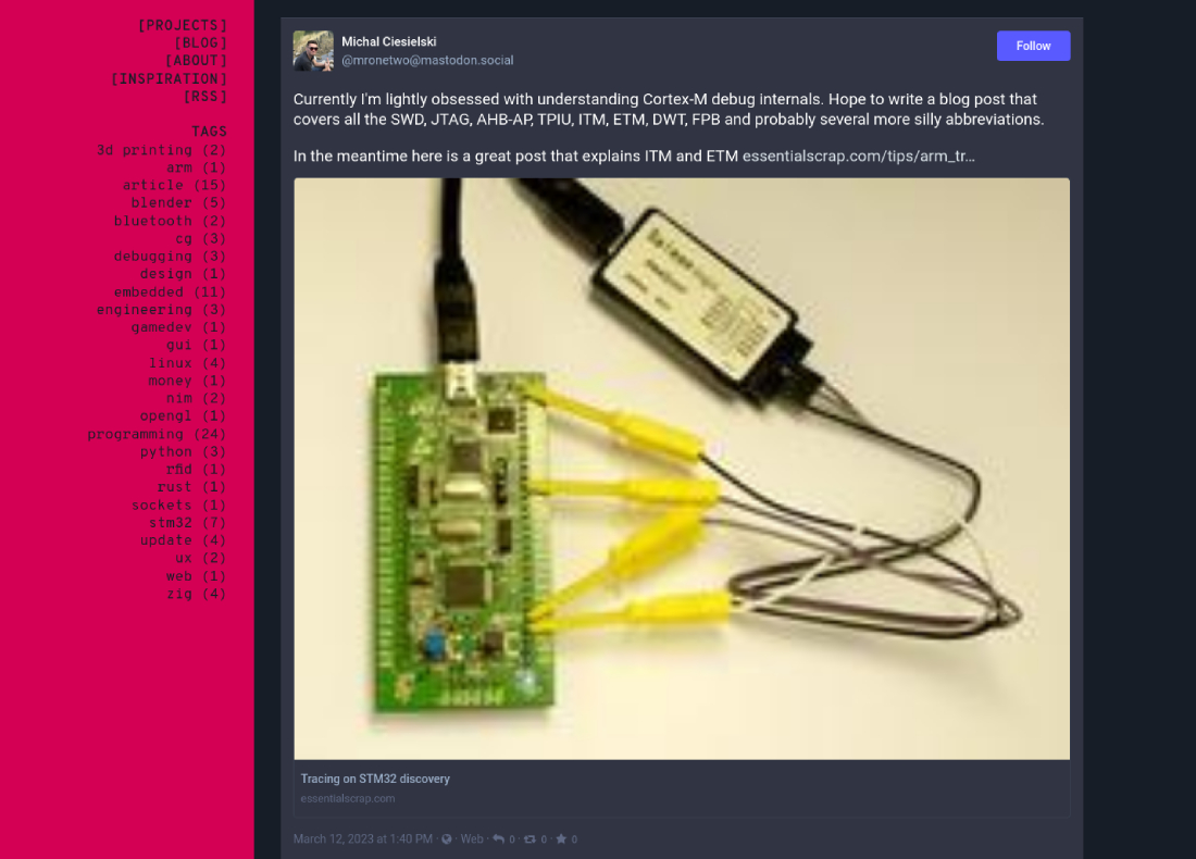
Some time ago I’ve embedded a toot, from my main Mastodon account, at the top of the projects page.
As you can see below, it wasn’t the best execution. It was embedded through the HTML’s iframe and
it took all the space it could, mainly because of the link preview.
I have moved to a custom setup, where I pull my latest toot, into a JSON file, and embed it into website’s code, using Hugo.
import feedparser
import json
import sys

MASTODON_LINK = 'https://mastodon.social/@mronetwo'
feed = feedparser.parse(MASTODON_LINK + '.rss')

# Just a way to look up what's in the entry.
# print(feed.entries[0])

toot_data = dict()
toot_data['summary'] = feed.entries[0].summary
toot_data['date'] = feed.entries[0].published
toot_data['base_url'] = feed.href
toot_data['mastodon'] = MASTODON_LINK

out_data = json.dumps(toot_data, indent=2)
sys.stdout.write(out_data)
It was trivial to pull the latest toot, thanks to the Mastodon’s RSS feed. I grab the latest toot, pick the relevant data and save it as a JSON string. I then output that string to a standard output, which I can easily pipe into a file.
python3 mastodon_rss.py > data/toot.jsonI have added a small piece of code in the theme/layouts/index.html which, if the data/toot.json
exists, embeds that data into website’s code. The .Site.Data.toot searches for the toot file in
the data directory. The actual toot contents are already HTML, so I embed it using Hugo’s
safeHTML function.
{{ with .Site.Data.toot }}
<div class="toot-container">
  <p class="toot-header">
  <a href="{{- .mastodon -}}">{{- .mastodon -}}</a>
  <div class="toot-content">
    {{- safeHTML .summary -}}
  </div>
  </div>
{{ end }}
The result is way more subtle than the original.
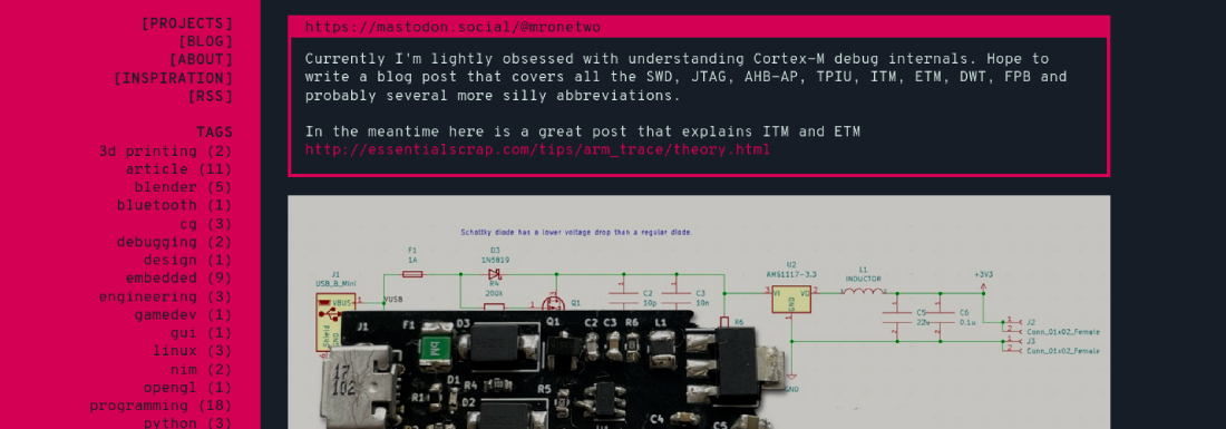
There’s definitely space to improve it, but for now I’ll leave it at that.
I have also improved the CSS in quite a few places. I’m leveraging Hugo’s toCSS, to convert the
SCSS stylesheet into CSS document. Previously I have used Python’s boussole
to do that. It makes CI significantly slower to install boussole,
since it has to compile the libSass. It also reloads the CSS whenever I modify the main.scss
file. That wasn’t the case with the boussole setup.
One last thing I’d like to mention is that I have written my own comment system, using HTMX. I’d like to migrate to it soon. Since it’s extremely simple, it will be very easy to keep current comments - there aren’t many.
I’m not updating this project entry too often. Not surprisingly, working on my projects, content for this website and its form is not easy. In spite of that, it’s sometimes very calming to sit down and fight with the CSS a bit. Those last two days I managed to simplify the page’s layout - it’s less buggy and works better with mobile devices. I don’t feel like spending time on explaining those problems provides much value for anyone except for very unexperienced web developers. I’m sorry but this is not the place to learn advanced web development. If there is one thing that I might bestow upon you, after my latest work, it’d be to check the SASS’s ampersand operator.
I started using the ampersand operator and I quite like it:
a {
color: $leftpane-bg;
text-decoration: none;
&:hover, &:focus {
color: lighten(saturate($leftpane-bg, 20%), 10%);
text-decoration: none;
}
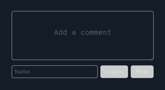
}One other things I have changed is styling for the comments section. Here is how it looked before.
Just several tweaks later it’s speaking the same design language as the rest of this website.
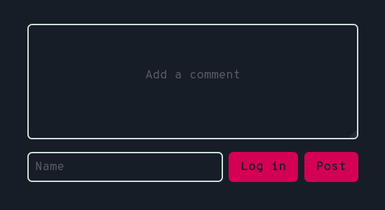
I’m using Cactus comments, which pulls its own CSS stylesheet. My own
stylesheet then overrides classes’ parameters, thanks to CSS’s !important keyword.
Fixing comments’ elements took way too much time, but sometimes things just need to wait their turn. I have moments when maintaining a website frustrates me, but I try to remind myself that this is a learning experience. Nothing I make here gets to be perfect on the first try.
If you want a great final result, from the get go, spin up your website using one of the proven themes. Otherwise, be patient and let your space evolve with time.
This website has always been a project and currently it’s my longest running one (I’ve bought the ciesie.com domain on 25th of January, 2018). Feels only natural to create a project entry for it.
I’ve attempted to start a website/blog several times. It took a while to find a setup that I enjoy maintaining. After bouncing between Content Management Systems, I’ve found the static website generators. Currently I’m using Hugo - probably the most popular static website generator. It took a bit of time to learn it and I’m still learning anytime I come back to improve this website.
This is how the website looks on the 28th of November, 2021:
Consider this to be an archive for this website. This theme has been written by me but it’s soon time to move to something new. I always wanted to have a website which I designed and wrote. This is the space that I fully own and I want it to reflect my sensibilities. This look was inspired by terminal windows, which for me translated to monospaced fonts, limited color palette, text on a grid, minimalism etc. While I’m proud of it, I feel like it has run its course. I haven’t even started working on a new theme but redesigning this website has been in the back of my head for a long while now.
The contemporary web design doesn’t focus on something that I value - performance. This one is difficult for me because on one hand I really want this website to be lightweight and fast but on the other hand I’m a sucker for pretty things. I don’t want your browser to pull megabytes of data while navigating this website but having a 3D model of a PCB, embedded in an article, feels nice. Does it add proportional amount of value compared to the performance hit? Difficult to say. Do I like it there? Yes.
While this website is very minimalistic, I don’t want to be dogmatic about this. Some of the designs that I’d like to try in future might be less restrained but performance will always be on the top of my priorities list.
I won’t talk much about content here but one thing that those past few years of writing has taught me is the importance of clear writing and how difficult it is to achieve. English isn’t my first language and I have never been a great writer. I’m still not and I don’t think I’ll ever be, but I do see improvement. I notice that mostly when I go back to a piece I’ve written some time ago and I find it difficult to understand and follow. It doesn’t happen nearly as often as it should but I do rewrite content on this website. I’ve never thought I would learn to value writing skills as much as I do right now.